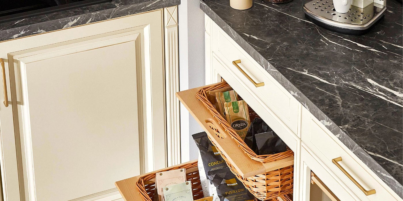
A reminder that even a neutral kitchen can play with joyful tones.
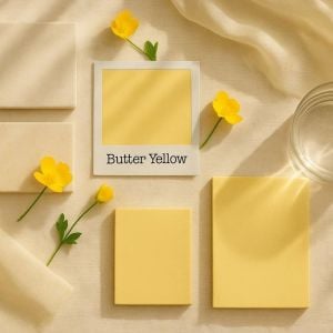
There’s something about May that makes everything feel a little lighter. The sun sticks around for longer, the garden starts doing its thing, and it suddenly doesn’t feel strange to have your morning coffee outside. It’s the month where spring properly shows up—brighter skies, softer evenings, and a real sense that Summer is on its way. So, it felt like the perfect moment to spotlight a colour that captures that easy warmth: Butter Yellow.
Soft, Subtle, and Full of Sunshine
Butter Yellow is not one of those colours that marches into a room with jazz hands and demands attention. No, this one floats in—easy-going and unbothered. It’s the colour of warm toast and morning light, of primrose petals and lemon curd tarts. It’s joyful, but it doesn’t shout about it.
It’s also a world away from that dreaded word many of us associate with a certain shade of yellowed beige: magnolia. (Shudder.) Magnolia walks into the room and tells you the landlord didn’t want to take any risks. Butter Yellow, on the other hand, feels intentional. Chic. Considered. It says, “I chose this colour because it makes me feel good”—and that’s what good interiors should do.
A Colour that Plays Well with Others
One of the best things about Butter Yellow is how easily it plays with other colours and textures. It’s a perfect companion to natural tones—think pale oaks, soft linens, white ceramics and warm neutrals. It adds a cheerful lift to minimal schemes without overpowering them.
Pair it with warm whites and off-creams for a kitchen that feels light and airy, or layer it with soft sage greens and pale peachy pinks for a dreamy, muted pastel palette that feels very May-in-a-mug-of-tea. I especially love it with pale, grey-veined marble or off-white quartz—it’s quietly elegant but with a gentle nod to retro charm.
In darker kitchens, Butter Yellow can add contrast and brightness without being jarring. A yellow tile splashback behind deep navy cabinetry? Yes, please. A pale yellow vase sitting against matte charcoal worktops? Instant uplift.
Kitchen Style in a Lighter Mood
If you’re looking to design a kitchen that feels happy—yes, happy—then Butter Yellow is your best friend. Whether you commit to it with cabinetry, or gently invite it in with smaller elements like bar stools, ceramics, or fabric choices, it brings a brightness that lifts the whole room.
One of my favourite uses of Butter Yellow is in kitchens that open out to the garden. Whether it’s through a wall of bifold doors or a little cottage-style back door with herbs on the step, this colour pulls the outdoors in. Picture the sun spilling into the room, and Butter Yellow surfaces reflecting that warmth back—it’s like capturing sunshine in your decor.
It’s particularly lovely in kitchens with country-modern leanings: shaker doors, open shelves, maybe a butler sink and some beautiful unlacquered brass. But it can also lean contemporary, especially when used with sharp slab doors and minimalist details. Add a few pops of black or deep bronze hardware, and you’ve got a space that’s sunny but sleek.

Colour Combinations I Love with Butter Yellow
Here are a few combinations that are singing to me this season:
● Butter Yellow + Cornflower Blue: Fresh, floral and a little nostalgic.
● Butter Yellow + Pale Peach + Sage: A spring garden palette that feels straight from an impressionist painting.
● Butter Yellow + Charcoal + Brass: Modern with a golden twist.
● Butter Yellow + Off-White + Warm Oak: Pure warmth and timelessness.
Each of these combinations tells a different story, but they all begin with the same feeling: warmth and joy.
The Warmth of a Yellow Morning
Butter Yellow is also an incredibly flattering colour. It glows softly in both natural and artificial light, making it feel welcoming at all times of day. There’s a reason cafés and breakfast nooks often feature tones like this—it sets a tone. It says: slow mornings, warm coffee, fresh croissants.
Even a single painted wall in this colour can make a huge difference. If you’re not quite ready for yellow cabinets, then consider a butter-hued wall to frame your dining space or surround a kitchen banquette. Add a few mismatched art prints, a vase of tulips or a lemon tree, and you’re practically in Provence.
Little Touches, Big Impact
If you’re a bit colour-shy (and that’s perfectly okay), try bringing Butter Yellow in through smaller details. Here are some ideas I’ve been loving:
● A stack of vintage yellow plates or mugs on open shelving.
● A yellow striped cushion on a built-in bench.
● Glazed tiles with that gorgeous handmade variation in tone.
● A painted stool or bar chair—such a simple way to nod to the trend without going all in.
Butter Yellow also works beautifully in accessories—tea towels, pendant lights, even flowers (hello daffodils, ranunculus, and creamy yellow tulips). It’s a gentle injection of joy.
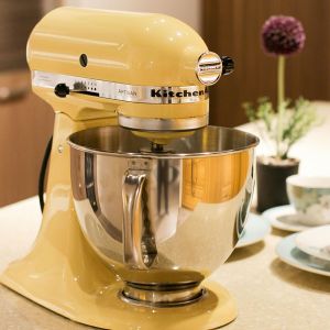
And speaking of small-but-mighty statements, KitchenAid’s Colour of the Year is—yes, you guessed it—Butter Yellow. Their iconic mixers are available in this delicious shade, and they’re just as much a design statement as they are a kitchen essential. It’s a perfect way to nod to the trend without lifting a paintbrush. You can shop them on our website or pop into our Ber Street showroom to see the colour in all its sunny glory—it’s even better in person.
A Colour for the Senses
What I love most about Butter Yellow is that it’s more than a colour—it’s a feeling. It’s the colour equivalent of warm skin in the sunshine. It has that same sense of calm and contentment. In the kitchen, where we begin our days and so often end them too, it feels like a little mental reset.
It reminds us to pause, to breathe, to smile.
Design, for me, is always about how a space makes you feel. And I’ve found that yellow—especially this soft, creamy shade—is one of those colours that people fall in love with slowly. It creeps in through the corners and the details, until suddenly your kitchen just feels… happier.
A Few Favourite Buttery Things This Month
● Little Greene’s “Sunlight”: Golden-toned yellow that feels fresh and gently uplifting.
● Farrow & Ball’s “Dorset Cream”: Creamy, mellow yellow with timeless warmth and a traditional charm.
● OKA’s Set of Four Winslow Side Plates “Yellow”: A perfect pop of colour at the table.
● Habulous’ Bud Vases “Light Yellow Stoneware”: Ideal holders for a few simple flowers, dried flowers or nothing at all.

Come and see it in full bloom
If you’re passing by our Ber Street showroom, you won’t miss our Colour of the Month window display. We’ve gone bold with giant paper flowers in soft yellows and a whisper of blue to hint at next month’s shade. It’s as cheerful as a spring morning and designed to bring a smile to your face. Pop by and have a peek—we’d love to show you what’s new.
Final Thoughts from My Kitchen Notebook
Whether it’s a full kitchen redesign or a gentle seasonal refresh, Butter Yellow is one of those colours that delivers on emotion as much as aesthetics. It’s kind, it’s warm, and it never feels too much. It’s sunshine without the sunburn.
You’ll always find my mood boards full of little golden touches because I can’t resist the cheer it brings, so on your next visit into Norwich, you’re welcome to create your own happy palette with our kitchen samples.
Here’s to May, to the sunshine ahead, and to the colour that brings breakfast-in-bed energy to your entire kitchen—if you’ve spotted a hint of Butter Yellow somewhere that’s inspired you, we’d love to hear about it over on our socials.