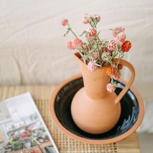
Terracotta. Even just saying it feels warm, doesn’t it?
July’s colour of the month is all about sunbaked charm – that Mediterranean palette that makes you want to throw open the windows, pour a glass of something sparkling, and imagine yourself somewhere on the Italian coast.
And while we sadly can’t offer you a beach, we can bring a little of that golden, dusty, effortlessly stylish feeling into the kitchen.
A Colour That Feels Like Summer
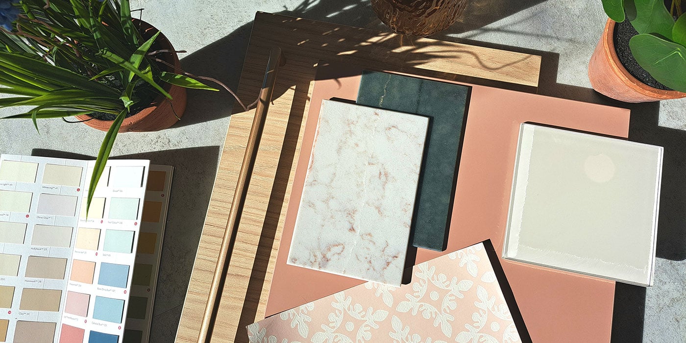
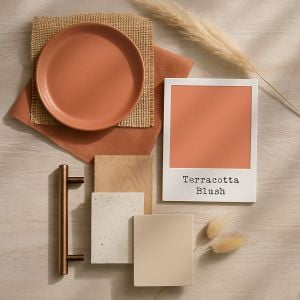
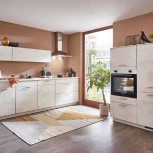
Terracotta Blush sits somewhere between a soft clay pink and a sun-warmed rust. Not quite as deep as burnt orange, not as sweet as cherry blossom – it’s a beautifully muted tone that still feels full of character.
In the summer months, when the light hits it just right, it glows. Add in some voile curtains moving gently in the breeze, maybe a terracotta pot of rosemary on the windowsill, and suddenly you’ve built a holiday moment into your weekday lunch prep.
This shade plays so nicely with texture – think limewash walls, rough plaster finishes, earthy tiles, and anything that makes you want to run your hands over the surface.
A Mediterranean Mood (In Norwich)
We’re seeing more people lean into that laid-back, rustic-modern look. Terracotta Blush is a key player in that palette – especially when paired with olive green, chalky whites, natural woods, and soft stone tones.
A few pairings to try:
- Terracotta Blush walls + olive trees in textured pots + warm ivory cabinetry = Ibiza calm
- Terracotta cabinets + sandy walls + black iron handles = modern meets rustic
- Plaster-effect walls + veined quartz worktops + warm wood flooring = soft Mediterranean elegance
What’s lovely about this tone is that it can go either way – it can be bold and vibrant in the right setting, or softened and subtle when teamed with neutral textures and relaxed styling.
Cabinetry That Glows
Yes, you can absolutely have Terracotta Blush cabinets. And no, it doesn’t have to feel ‘too much’.
A terracotta-toned kitchen is surprisingly versatile. With the right shade and finish, it creates warmth without dominating the space. In a matte door, it’s earthy and grounded; in a silkier finish it adds sophistication. Pair with creamy quartz worktops or a soft travertine-style surface, and you’ve got something that feels pulled together effortlessly.
For handles, consider warm metals like brushed brass or even black to add definition. Or skip handles altogether and let the colour do the talking.

Modern or Rustic?
This is a colour that can sit happily in both traditional and contemporary spaces.
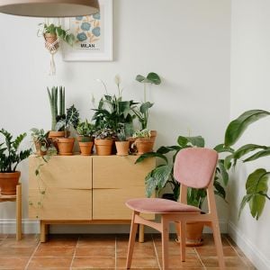
For a rustic feel, layer it with aged timber, pottery, and woven textures. Terracotta Blush works beautifully alongside heritage-style appliances and classic tiling. If you love the warmth of terracotta but aren’t sure about committing to it on cabinetry or walls, consider introducing it through flooring.
The Marlborough Terracotta Parquet tiles from Ca’ Pietra, for example, offer a timeless, tumbled look – full of texture and soft variation. They feel lived-in from day one, adding instant soul to a kitchen space. Underfoot, they bring a gentle warmth and a Mediterranean charm that pairs effortlessly with pale cabinetry, tongue-and-groove panelling, and those quiet kitchen moments when the kettle’s just boiled.
For a modern look, think clean lines, push-to-open cabinetry, minimal styling and bold pairings – perhaps a graphic tiled splashback or an understated pale quartz. Terracotta Blush is just soft enough to feel cosy and just interesting enough to stand out.
Lighting, Texture & Tone: Terracotta’s Perfect Match
Terracotta Blush has a softness that feels almost weightless. It’s not loud or overpowering, but it still leaves an impression. The kind of colour that shifts with the light and always feels like it belongs.
In a kitchen setting, how you light it makes all the difference. Warm white under-cabinet lighting can enhance its rosy undertones without making the space feel too yellow or stark. Dimmable pendants over an island or table can bring out its richness in the evening, letting the space glow rather than glare. And if you’re embracing the limewash or plaster-effect walls, consider adding wall sconces to gently graze that textured surface. The interplay of light and finish adds depth – especially when balanced with the smoother, flatter profile of a modern cupboard door.
This all ties back to the idea of a cohesive kitchen story. Layering textures and tones with intention – from your cabinetry and wall colour to your tiles and lighting – helps create a space that feels thoughtful, not thrown together.
If you’re leaning toward a more contemporary style, Terracotta Blush pairs surprisingly well with dark navy cabinetry or deep slate hues. The contrast feels fresh and confident – but again, lighting is key. Cool LEDs might flatten the mood, while adjustable warm-toned lights allow you to shift the ambience depending on the time of day or the atmosphere you’re after.
My Favourite Terracotta Things
As always, I couldn’t resist listing a few things I currently love in this month’s colour:
- Farrow & Ball’s “Red Earth”: A warm, grounded terracotta with plenty of character.
- Little Greene “Tuscan Red”: Dusty, mellow, sunbaked (basically Tuscany in a tin).
- Terracotta Linen Napkins from Bed Threads: The perfect table pairing.
- Marlborough Terracotta Picket Floor Tiles from Ca’ Pietra: Just enough texture and colour variation to feel relaxed, not fussy.
Terracotta Blush might just be the colour you didn’t know you needed – whether that’s as a bold move on your cabinetry or a gentle wash across the walls. And if you’re still not sure, pop into the showroom. We’re happy to show you swatches, mood boards and ideas.