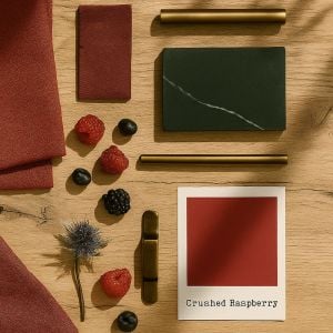
If October had a signature shade, it would surely be Crushed Raspberry. Rich, warm, and just the right side of dramatic, it captures everything the season stands for – the shift in light, the glow of autumn leaves, the sense of retreating indoors to cocoon ourselves as the nights draw in. This is a colour that doesn’t just sit quietly in the background – it makes a statement, and it does so with confidence.
Deep raspberry tones bring both energy and elegance. They’re bold enough to stand alone but nuanced enough to layer with other hues, making them incredibly versatile. Whether you’re introducing it through cabinetry, furniture, or smaller decorative details, Crushed Raspberry has the power to transform a space into something memorable.
Autumn, Bottled
There’s something unmistakably autumnal about raspberry tones. They echo the reddened edges of October leaves, the depth of mulled wine, even the warmth of a roaring fire. Bring this shade into your kitchen and you instantly give it a sense of richness – a reminder of the season but also a timeless note that feels just as right in the depths of winter or the height of summer.
What I love about a shade like this is that it offers both vibrancy and grounding. In daylight it can feel punchy and expressive; by evening, with soft lighting, it mellows into something cocooning and intimate. It’s one of those colours that changes character with the time of day, keeping your kitchen feeling dynamic and alive.

Two-Tone Temptations
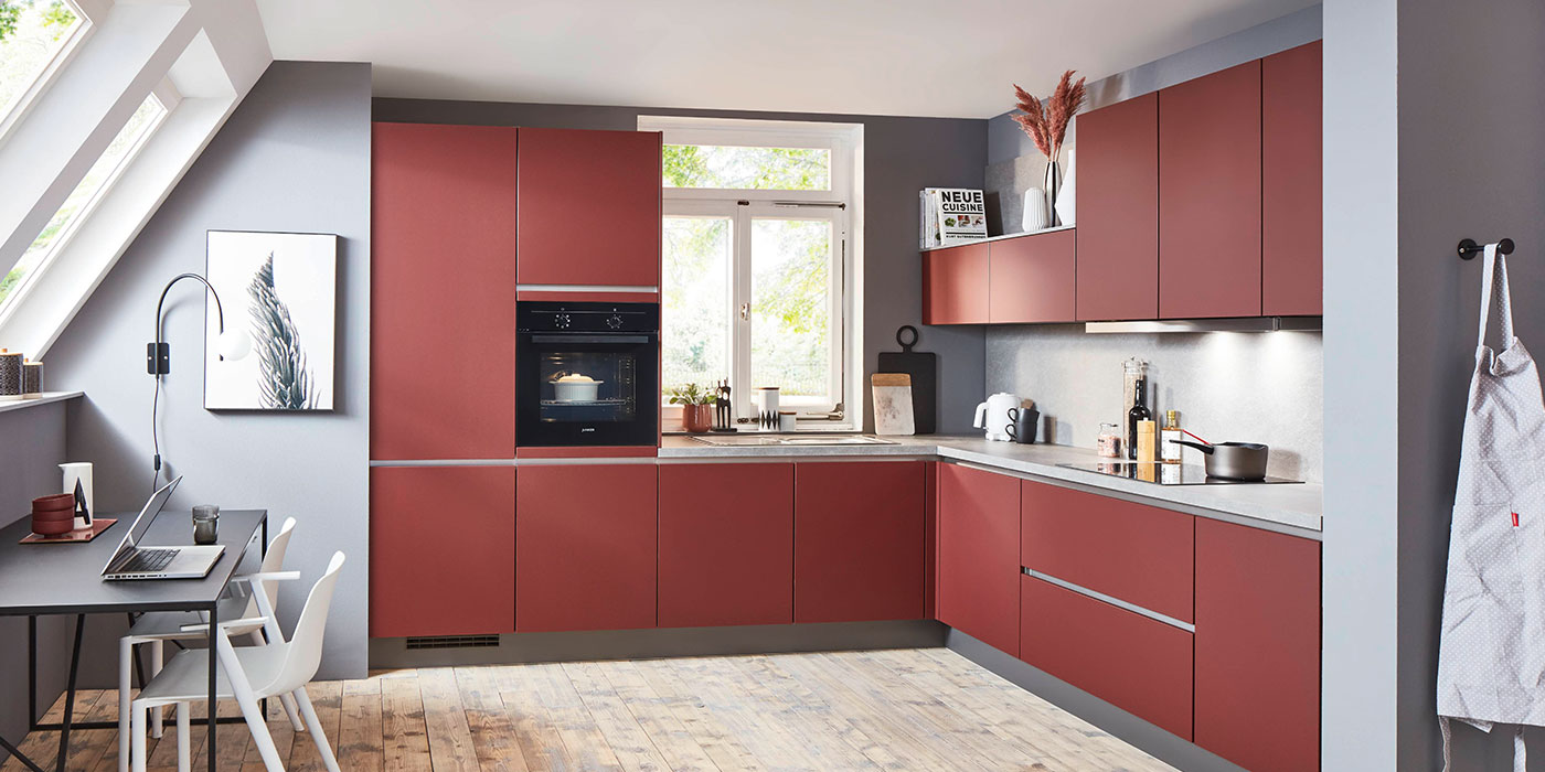
For many, the thought of committing to deep raspberry cabinetry everywhere might feel a little overwhelming. That’s where two-tone kitchens really come into their own. Pair raspberry base cabinets with lighter wall units in a soft beige, a pale stone, or even a warm neutral grey. The contrast grounds the look, giving you all the drama of colour without overwhelming the room.
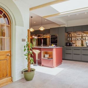
Another option is to make raspberry the star of your island. An island in this shade instantly becomes a centrepiece – a place to gather, chat, and perch with a glass of wine. Surround it with more neutral cabinetry and you’ll have a striking focal point without tipping into excess.

Drenching in Drama
Of course, for the bold at heart, colour drenching is always on the table. That means raspberry walls, doors, architraves, even ceilings. Done well, it creates a cocoon-like effect – intimate, eclectic, and deeply atmospheric. Add in layers of lighting, perhaps even a statement chandelier above an island or dining table, and you’ve got a kitchen that doesn’t just function, it performs.
The key with colour drenching is balance. Consider your finishes carefully – brushed brass handles, aged bronze light fittings, or even matte black accents all work beautifully against raspberry’s depth. Introduce too much gloss and it can jar; keep it to warm metallics and textured finishes, and you’ll enhance the richness of the shade.

Seasonal Shifts in Style
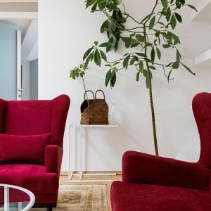
As the seasons turn and wardrobes fill with deeper tones, our homes can follow suit. Just as a berry-toned scarf or velvet jacket signals autumn’s arrival, soft furnishings in shades like Crushed Raspberry bring that same warmth indoors.
Now’s the moment to roll out a dark red Persian rug in front of the fire, change lampshades to a rich raspberry hue, and let the glow of evening light filter through – a little mysterious, a little romantic. Even swapping cushions, adding a throw, or introducing darker ceramics can transform a room’s atmosphere. These small touches echo the richness of the season without demanding a full redesign.
Colour Pairings
- Crushed Raspberry + Ochre = Rich and Comforting
A pairing that feels quietly indulgent. The warmth of ochre softens raspberry’s energy, creating a palette that’s both uplifting and grounded. You don’t need bold cabinetry to enjoy it – even a vase of flowers, a piece of art, or a cushion in these tones can bring that same sense of luxury. - Crushed Raspberry + Ink Blue = Sophisticated and Dramatic
Inky blue brings calm to raspberry’s vibrancy, making this duo feel elegant and confident. Perfect for kitchens with a touch of theatre – think dark cabinetry, brass accents, or moody evening light glinting off glassware. - Crushed Raspberry + Soft Grey = Balanced and Understated
Soft grey lets raspberry shine without shouting. It’s a fresh, modern pairing that feels composed but still inviting, especially when layered with natural textures like pale wood or brushed steel. - Crushed Raspberry + Forest Green = Earthy and Artistic
This one feels straight from nature – deep green and berry tones echo woodland warmth. Together they create a palette that’s rich, organic, and full of personality, perfect for those who love a kitchen with a story.


My Favourite Raspberry Things
Here are a few ways to bring Crushed Raspberry into your home right now:
- Farrow & Ball “Radicchio”: A deep, warm red with a slight berry undertone. Dramatic but sophisticated, perfect for islands or feature walls.
- Little Greene “Baked Cherry”: A more muted raspberry that feels soft and cocooning, ideal for colour drenching.
- Anthropologie Velvet Dining Chairs in Berry: Bold, plush, and perfect for adding texture and depth around a table or island.
- Nkuku Hand-Glazed Raspberry Ceramic Mugs: Everyday items that add warmth and personality without commitment.
Final Thought
Crushed Raspberry is a colour that makes a kitchen feel alive. It’s bold without being brash, elegant without being aloof. It reminds us of autumn leaves, of warmth, of gatherings that stretch long into the evening. Whether you commit to it fully or simply flirt with it in accessories, it’s a tone that will always add richness and depth.
So, as the nights draw in and the leaves turn, perhaps it’s time to let raspberry in – to your kitchen, your dining room, even your breakfast nook. A colour that speaks of both heritage and modernity, it’s ready to transform your space into something memorable, inviting, and distinctly yours.
