
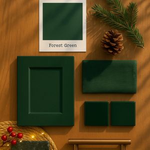
There are colours that whisper, and colours that quietly command a room without raising their voice. Forest Green belongs firmly in the latter camp. It’s deep, steady, and quietly confident, the sort of green that feels at home both in a grand Victorian terrace and a modern, pared-back new build. It brings calm rather than drama, yet has enough presence to carry an entire scheme if you want it to. This is a shade with roots, in every sense of the word.
Full immersion or a balanced pairing
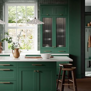
Some homeowners fall in love with the idea of drenching the entire kitchen in a deep green, cabinets and walls included, creating a seamless envelope of colour. It instantly sets a mood, particularly in spaces with limited natural light. Rather than fighting the shadows, you lean into them and create something quietly luxurious. A soft, matt finish works best for this. Gloss would break the magic.
Others prefer to let Forest Green be the leading player while lighter elements sit around it, supporting the atmosphere without competing. Pale stone worktops and splashbacks are excellent for this. The gentle contrast keeps the room feeling open, and the stone brings a coolness that offsets green’s natural warmth. Matching the wall colour to the cabinetry can look striking, but you can always break the continuity with pale veining across the worktop, or a slim upstand of a different material. The interplay between the darker joinery and the lighter stone is what gives the room its compositional balance.
Colour Pairings to Lift or Deepen the Mood
Forest Green is wonderfully flexible. A few combinations to spark ideas:
- Forest Green + ochre
Bold, warm and deliciously rich. Ochre has a golden depth that elevates green instantly, adding vibrancy without disrupting harmony. A single ochre vase, cushion or bar stool can make the whole room feel more luxurious. - Forest Green + dusty red
Think dried berries, aged terracotta, autumn foliage. Dusty reds bring an earthy softness that works beautifully alongside such a grounded hue. Together, they feel natural and timeless. - Forest Green + walnut
A refined, sophisticated pairing. Walnut’s darker grain echoes the depth of the green, making it ideal for more dramatic kitchens. - Forest Green + gold or brass
Knurled brass handles or pendants with warm-metal interiors cut through the darkness, catching and reflecting light in a way that feels both warm and tailored. - Forest Green + Aubergine
A rich, expressive combination. Aubergine’s velvety undertone adds a gentle opulence to Forest Green, creating a palette that feels both grounded and indulgent.

Texture, tone and the appliances we choose
Colour is only part of the story. Texture shapes the entire experience of a kitchen, and darker palettes benefit hugely from variation. Soft matt cabinet doors, smooth stone, gently grained timber, knurled metalwork – the layering is what makes a Forest Green palette come alive.
I’ve also been enjoying how certain small appliances can harmonise with deeper kitchen colours. KitchenAid’s Pebble Palm, in particular, works beautifully in a dark green. It has that organic, chalky tone that looks almost sculptural on a worktop. The colour and texture add a quiet modernity, while still feeling warm and tactile.

Timber in all the right places
Wood is a natural friend to green, but the choice of wood tone shifts the atmosphere entirely. Walnut has a sophistication that sits beautifully against dark green. The combination feels refined, almost club-like, without tipping into heaviness. Lighter timbers, meanwhile, introduce freshness. The contrast between pale oak and a deep green door can make the whole kitchen feel alive and modern.
Timber doesn’t need to be everywhere to make an impact. A breakfast bar in a contrasting wood can bring definition to the island area. Open shelving in a warm timber tone adds rhythm and a touch of the natural world. Even small inserts inside drawers or larders offer a lovely moment when you open a door. Spice racks framed by warm wood on the back of cabinet doors are both practical and unexpectedly beautiful.
Lighting that shapes the mood
Forest Green thrives in gentle light. Pendant shades with gold interiors have a particularly wonderful effect. When the light hits the metallic surface, it casts a soft glow that warms the green rather than making it recede. This is especially helpful in kitchens that lean towards the dramatic side of the palette. It introduces a flicker of brightness without disrupting the depth of the colour.
Wall lights with warmer bulbs can also help highlight textured surfaces. If you’ve chosen a stone with a pronounced vein or a splashback with a tactile finish, angled lighting will help bring those details forward without overwhelming the room.
Brass, faux leather and other finishing touches
Knurled brass handles are a favourite of mine in dark green kitchens. The ridged texture catches the light, and the metal’s warmth creates an elegant contrast against the depth of the cabinet doors. They work equally well on painted timber doors as they do on flat matt slab doors for a more contemporary look.
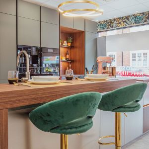
Tan is another lovely companion to Forest Green. Tan barstools in front of a dark green island feel grounded yet soft, and introducing tan elsewhere – perhaps through chopping boards, woven trays or even framed artwork – ties the whole palette together so the room feels intentional rather than pieced together over time.
My Favourite Forest Green Things
Here are some pieces currently inspiring this month’s palette:
- Farrow & Ball “Studio Green”: Deep, velvety and elegant; almost black in low light.
- Little Greene “Pompeian Ash”: Earthy and rich with an understated calm.
- Menique Linen Holiday Celebration Napkins in “Stone Green”: Soft, crumpled texture that adds depth to a winter table.
- Dibor Alpine Lodge Christmas Garland: A soft sweep of forest green that brings a little festive charm to any corner.
In Summary
Forest Green is a colour that brings depth, comfort, and a sense of quiet luxury into the kitchen. It’s grounding without feeling heavy, rich without overwhelming, and endlessly versatile in every season. Pair it with warm metals, layered timbers, soft textiles or pale stone, and it immediately settles into the room like it was always meant to be there.
So let the evenings soften, switch on the warm glow of your pendants, and enjoy the way this deep, natural green draws everything together – a palette that feels calm, connected, and wonderfully alive.