February always feels like a month caught between seasons. The sparkle of Christmas has long faded, spring bulbs are only just thinking about appearing, and we are still very much wrapped up in coats and cosy layers. It is exactly at this point in the year that I find myself craving light.
Not bright white. Not stark. But something softer. Something that whispers lightness rather than shouts it.
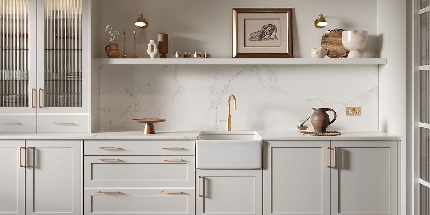
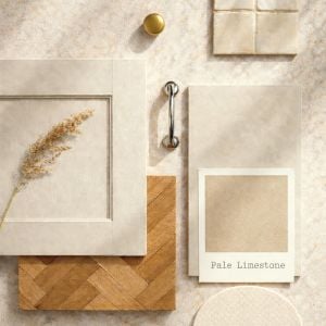
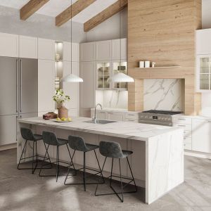
This month’s colour is Pale Limestone – a beautifully cool, chalky neutral that feels calm, elegant and quietly uplifting. It has that gentle mineral quality you see in old stone cottages, softened by time, yet it sits just as comfortably in a contemporary kitchen.
It is understated, but never dull. And in the cooler months, that makes all the difference.
A cool tone for cooler days
There is something particularly soothing about a cooler neutral in winter. While warm creams can feel cosy, a pale limestone tone brings clarity. It reflects what little daylight we have and carries it further into the room.
As the evenings slowly begin to stretch out, Pale Limestone feels like a soft promise of brighter days ahead.
If you are someone who misses the light during winter, introducing lighter furniture or cabinetry in this tone can genuinely transform how a space feels. Even on overcast days, the colour seems to hold onto brightness, giving kitchens a fresher, more open atmosphere.
Think:
- Pale Limestone cabinetry paired with light quartz worktops
- Soft linen bar stools instead of darker timber
- Brushed brass or chrome accents to bounce the light around
It is subtle, but incredibly effective.
Two-toned elegance
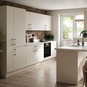
There is something very elegant about committing fully to one tone. A kitchen entirely in Pale Limestone feels seamless and considered. The smooth finish adds a refined, modern quality that works beautifully in both traditional and contemporary settings.
If you prefer a little contrast, Pale Limestone works wonderfully as part of a two-tone scheme.
You might choose:
- Pale Limestone on the wall units, with a deeper tone on the base cabinets
- Pale Limestone around the perimeter, with a contrasting island
- A darker pantry run, softened by Pale Limestone elsewhere
Pairing it with a deeper earthy shade can ground the space. Pairing it with a muted blue or green can create a subtle coastal or countryside influence.
The island is often the perfect place to introduce personality. A soft moody tone in the centre of the room, surrounded by Pale Limestone cabinetry, feels both practical and intentional.
It is about balance rather than bold contrast.
Blending refined and rustic
One of the reasons I love this shade so much is its versatility. While it naturally leans elegant and smooth, it also pairs beautifully with more rustic elements.
Imagine pale limestone cabinetry alongside timber shelving with rough, natural edges. The softness of the paint finish against the organic texture of raw wood creates that effortless blend of refined and relaxed.
Add herringbone wood flooring, a slightly glossy rustic tile splashback, woven baskets and natural ceramics. Suddenly, the kitchen feels layered and welcoming rather than polished and pristine.
It is this mix that gives a home personality.
The charm of limestone flooring
We cannot talk about this colour without talking about the material that inspired it.
Limestone floor tiles have long been associated with country kitchens and relaxed farmhouse living. They bring that beautiful, grounded feeling underfoot, instantly adding character to a space.
Beyond their visual appeal, limestone tiles are also remarkably practical. They are strong, resilient and well suited to busy households. With the right sealing and care, they cope confidently with everyday spills, foot traffic, pets padding in from the garden and the general rhythm of family life.
They handle warmth and moisture well, making them a sensible choice for kitchens where cooking, cleaning and gathering all happen at once.
And aesthetically? They offer that gorgeous country cottage feel so many people are drawn to.
Antique limestone, in particular, has a wonderfully timeworn quality. Its gently aged surface and softened edges create an authentic, nostalgic atmosphere. If you are hoping to achieve that lived-in, heritage look, antique finishes can instantly add depth and charm.
Creating a country look in a modern home
Achieving a true country aesthetic is often more nuanced than it first appears. When renovating newer properties, recreating that classic, rural character requires thoughtful, well-judged decisions.
It is not just about adding beams or choosing a traditional door style. It is about cohesion.
Pale Limestone can be the perfect foundation for this. It brings softness without feeling artificially aged. Layered with natural textures – timber, stone, linen, aged metals – it begins to tell a story.
The key is restraint.
Country style works best when it feels organic rather than overly themed. Let materials speak. Let finishes feel authentic. Allow the colour to unify everything quietly in the background.
Using Limestone on the walls
If you are not ready to change cabinetry, Pale Limestone still has a place in your home.
Little Greene’s Limestone paint shade offers a similar mineral softness that works beautifully on kitchen walls. Used as a backdrop, it provides a calm canvas for both painted cabinetry and natural wood finishes.
On walls, this tone:
- Softens strong architectural lines
- Reflects natural light without feeling cold
- Creates a seamless flow between kitchen and adjoining rooms
It pairs particularly well with off-white trims, brushed metal hardware and pale stone worktops. In open-plan spaces, it can carry through into dining or living areas, creating cohesion without monotony.
And in February, when we are all craving brightness but not yet ready for spring pastels, it feels just right.
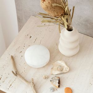
Favourite Pale Limestone Things Right Now
A few pieces that sit perfectly within this palette:
- Little Greene “Limestone”: A beautiful, mineral-toned neutral that works just as well on walls as it does across cabinetry
- Farrow & Ball “School House White”: Soft and chalky, perfect alongside Pale Limestone for a layered tonal scheme
- Antique limestone floor tiles from Baked Tiles: Timeworn texture that instantly adds country charm and depth
- Majid set of 3 beige travertine candle holders from Kave Home: décor like these can bring a soft, sculptural element that complements limestone tones beautifully
In Summary
Pale Limestone is a colour for February – calm, light-enhancing and quietly refined. As winter begins to loosen its grip and the days slowly stretch out, this soft mineral shade brings clarity and brightness without feeling stark.
Whether used across an entire kitchen, paired in a two-tone scheme, or layered with rustic timber and aged stone, it creates spaces that feel elegant, balanced and timeless.
It is proof that neutrals are never boring – they simply set the stage for everything else to shine.
And sometimes, the lightest colours carry the most presence.