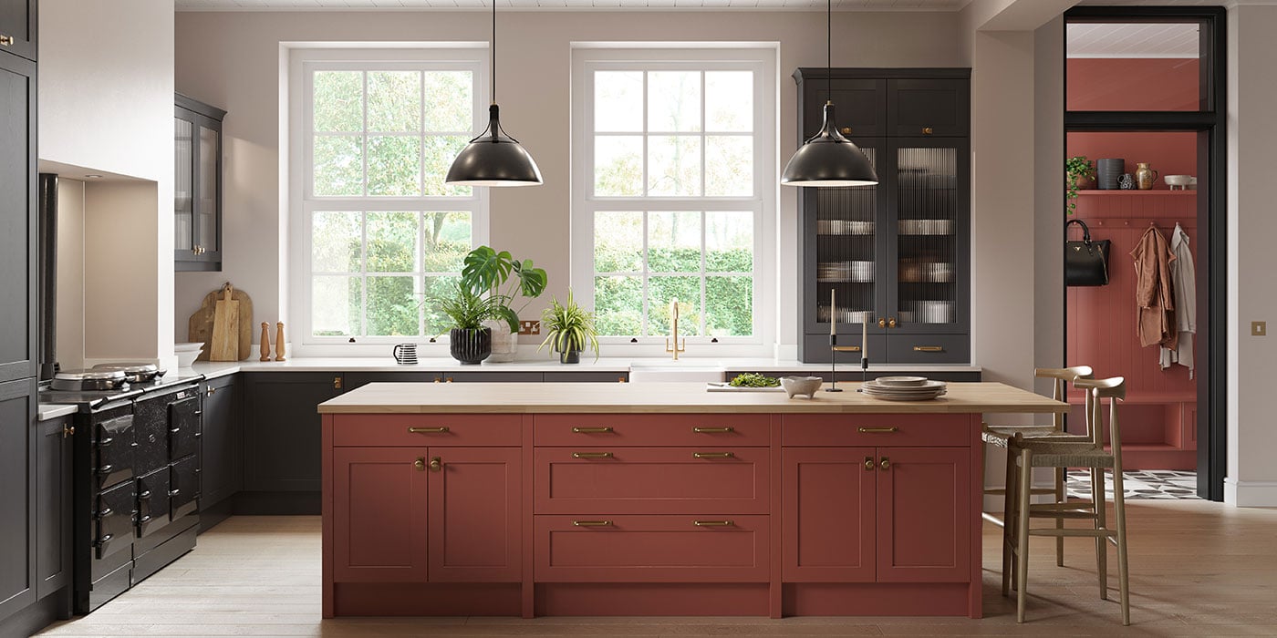
May always feels like the beginning of something. The evenings stretch out longer, garden furniture starts reappearing, and suddenly everyone is talking about holidays again – where they’re going, what they’re booking, or simply dreaming of somewhere warmer while the British weather continues to make up its mind.
And that feeling is exactly what inspired this month’s colour.
Papaya Orange is sunshine in interior form. Warm, rich and uplifting, it brings an instant sense of energy into a space without feeling harsh or overpowering. It’s deeper than a bright citrus tone and softer than a true terracotta – sitting somewhere between sun-baked clay, ripe papaya and the warmth of Mediterranean plaster walls glowing in late afternoon light.
It’s joyful. Confident. A little escapist.
And in a kitchen, it has the ability to completely shift the mood of a room.
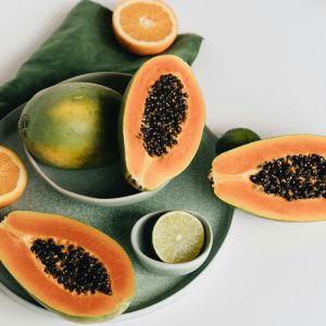
What is Papaya Orange?
Papaya Orange is a softened, earthy orange with warmth running through it. Unlike sharper oranges that can feel overpowering, this tone has a dustiness that makes it feel more relaxed and liveable.
It’s the colour of clay pots warming in the sun, faded market awnings, tiled courtyards and long lunches outdoors. There’s richness to it, but also softness.
That balance is what makes it work so beautifully in interiors. It adds personality and warmth without becoming overwhelming.
In kitchens especially, it creates an atmosphere that feels welcoming, sociable and full of life.
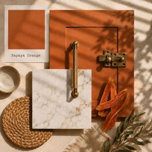
Why Orange Works So Well in a Kitchen
Orange is often associated with energy, creativity and warmth – all things that naturally belong in a kitchen. It’s a colour that encourages conversation and movement, making it ideal for spaces centred around gathering and hosting.
But Papaya Orange brings something softer than a bright statement shade. It still carries warmth and optimism, but in a way that feels grounded rather than loud.
There’s also something incredibly comforting about earthy tones. They connect us back to natural materials and landscapes, which is perhaps why kitchens in warmer climates often feel so inviting.
In a kitchen setting, Papaya Orange can:
- Make large spaces feel warmer and more intimate
- Bring brightness to rooms lacking sunlight
- Create a more relaxed, lived-in atmosphere
- Add personality without relying on trend-led styling
It’s bold, but it doesn’t try too hard.
Inspired by Holiday Living
There’s a reason this colour feels transportive.
Papaya Orange instantly brings to mind Mediterranean homes where kitchens spill into outdoor spaces, where bifold doors stand open and greenery blurs the line between indoors and out. You can almost imagine warm air drifting through linen curtains and terracotta pots overflowing with herbs.
And while May in the UK might still be unpredictable, interiors can still capture that feeling.
If your kitchen opens onto a garden or patio, Papaya Orange works beautifully in transition spaces. Framed by greenery, the warmth of the colour becomes even richer. Olive trees, rosemary, trailing plants or even simple pots of basil all feel naturally at home beside it.
It creates a space that feels relaxed, sun-soaked and gently escapist – even if it’s raining outside.
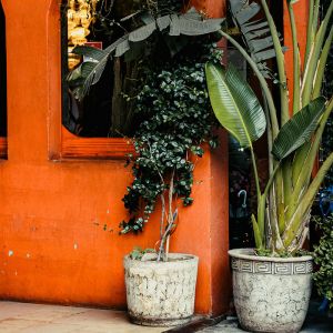
Colour Pairings That Bring Papaya Orange to Life
Papaya Orange becomes especially beautiful when layered with complementary tones and materials.
Papaya Orange + Natural Timber
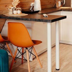
One of the warmest pairings possible. Timber flooring, exposed beams or oak shelving ground the colour and prevent it from feeling overly decorative. The combination feels rustic, relaxed and incredibly inviting.
Papaya Orange + Creamy Stone
Light quartz or softly veined stone surfaces balance the richness of the cabinetry. Cream tones keep everything feeling airy while allowing the orange to remain the focal point.
Papaya Orange + Brass
Aged or brushed brass adds depth and glow. Against warm orange tones, brass feels cohesive rather than contrasting – especially on taps and handles.
Papaya Orange + Dusty Green
Muted greens create a beautiful connection to nature. Think sage upholstery, olive-toned accessories or houseplants layered throughout the space.
Papaya Orange + Deep Plum or Aubergine
For something moodier and more unexpected, deeper berry tones add richness and drama. Used sparingly through artwork, seating or decorative accessories, this combination feels luxurious and slightly bohemian.
Bringing Papaya Orange Into the Kitchen
There are so many ways to introduce this colour depending on how expressive you want the final look to feel.
Cabinetry
Papaya Orange cabinetry instantly transforms a kitchen into something full of warmth and character. On shaker doors, it feels rustic and Mediterranean-inspired. On flatter slab doors, it becomes more contemporary and playful.
An island in this tone can also work beautifully if you want a focal point without committing to the entire room.
Walls
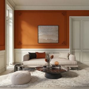
If you’re feeling bold, Papaya Orange walls create an incredibly cocooning atmosphere, especially in kitchens with natural light. Paired with plants and timber, the effect feels earthy and sunlit rather than overwhelming.
Carrying the colour onto surrounding walls can also soften the transition between cabinetry and architecture, helping the room feel immersive and layered.
Open Shelving and Styling
Open shelving works particularly well against this tone. Ceramics, glassware and greenery all stand out beautifully, especially in softer neutrals or rich olive shades.
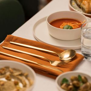
Even simple styling details – woven baskets, linen napkins, hand-thrown pottery – feel elevated against this backdrop.
Materials That Complement the Palette
Papaya Orange thrives when paired with tactile, natural materials.
Timber beams or flooring add structure and warmth, especially in kitchens aiming for a relaxed, European feel. Slightly weathered or matte finishes work best here rather than anything too polished.
Belfast sinks also feel particularly at home within this palette. The crisp white ceramic contrasts beautifully against warm cabinetry, creating a timeless balance between rustic and refined.
Stone surfaces with subtle movement help break up the warmth while keeping everything cohesive. Honed finishes or softly textured tiles work especially well.
Then there’s lighting. Warm lighting is essential with this colour. Pendant lights with brass interiors or woven shades create a soft glow in the evenings, making the space feel even more inviting.
Traditional or Modern – It Works Both Ways
In traditional kitchens, Papaya Orange feels charming and full of personality. Pair it with shaker cabinetry, brass cup handles, timber shelving and natural stone flooring for a look that feels collected over time.
In more modern spaces, the same colour becomes bolder and more architectural. Slab doors, integrated appliances and cleaner lines allow the warmth of the colour to become the main statement.
The beauty of Papaya Orange is that it adapts. It can feel rustic, contemporary, playful or sophisticated depending on how it’s styled.
Favourite Papaya Orange Things Right Now
A few pieces and finishes we’re loving within this palette:
- Farrow & Ball “Charlotte’s Locks”: A beautifully dramatic, earthy orange tone
- Little Greene “Heat”: A strong, contemporary burnt orange
- Hand-thrown terracotta plant pots: Warm, rustic and perfect against greenery
- Divertimenti Bordallo Pinheiro Papaya Serving Platter: A sweet statement for the centre of the table
In Summary
Papaya Orange is a colour for May – warm, uplifting and full of escapism. Inspired by sun-soaked holidays, Mediterranean interiors and the optimism of longer days, it brings energy and personality into the kitchen while still feeling grounded and liveable.
Whether layered with timber, softened with creamy stone, or surrounded by greenery and open doors to the garden, it creates spaces that feel relaxed, welcoming and full of warmth.
A reminder that interiors don’t always need to be neutral to feel timeless.
Sometimes, a little sunshine is exactly what a kitchen needs.