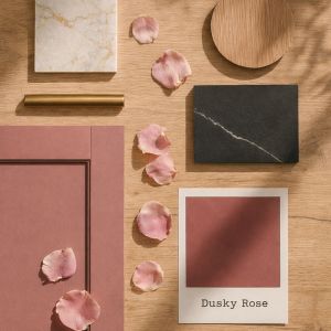
January has a habit of feeling a little bare. The rush of December fades, the days are short, and the light outside turns softer, quieter. But there’s a particular moment we love at this time of year – those winter sunsets, sometimes glowing through crisp air or reflecting off an unexpected dusting of snow. The sky shifts into muted pinks, mauves and lilacs, blurred and beautiful.
That’s where Dusky Rose comes in.
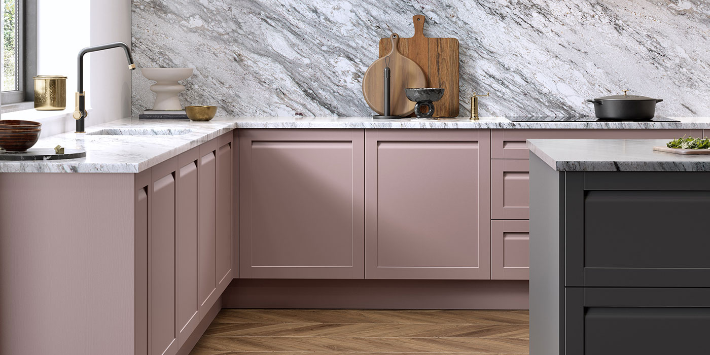
This is not a sugary pink or a playful pastel. Dusky Rose is rounded, earthy and calm – a softened, grown-up colour that feels comforting without being flat. Bringing it indoors captures that same hush you feel at dusk, wrapping a space in warmth and ease.
For January, it’s the perfect antidote to grey days.
What is Dusky Rose?
Dusky Rose sits somewhere between pink, mauve and warm neutral. It has a dusty undertone that removes any sharpness, giving it a plaster-like quality that feels tactile and grounded rather than decorative.
In kitchens, this matters. A colour that’s too sweet can feel temporary, but Dusky Rose has depth – it lives comfortably alongside stone, timber and metal finishes, evolving gently throughout the day as the light changes.
It’s soft, but never bland. Calm, but never cold.
Why Dusky Rose Works So Well in a Kitchen
Kitchens are often the most emotionally charged room in the home – busy, social, practical, and personal all at once. Dusky Rose has a way of smoothing the edges.
Studies into colour psychology suggest that muted pinks can help reduce feelings of agitation and stress, creating environments that feel more settled and restorative. It’s why similar tones have been used historically in spaces designed for calm and reflection.
In a kitchen setting, that translates beautifully:
- A gentler atmosphere during busy mornings
- A soothing backdrop for evening cooking
- A space that feels welcoming rather than demanding
It’s a colour that quietly supports the rhythm of everyday life.
Colour Pairings That Bring Dusky Rose to Life
Rather than thinking of Dusky Rose as a standalone colour, it works best when paired thoughtfully. Here are some combinations that feel especially considered in kitchens:
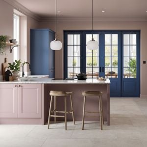
Dusky Rose + Charcoal = A grounding contrast that keeps the palette modern and composed. Charcoal islands or tall units anchor the softness of Dusky Rose without making it feel heavy. The result is calm, confident and contemporary – soft edges, no harshness.
Dusky Rose + Cream = An effortless, elegant pairing. Cream worktops, tiles or walls lift the pink and enhance its warmth, creating a serene and timeless look that feels particularly good in winter light.
Dusky Rose + Brass = Brushed or aged brass adds warmth and quiet luxury. Against Dusky Rose cabinetry, brass handles and taps feel intentional rather than showy – especially beautiful on shaker doors or traditional details.
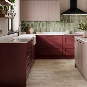
Dusky Rose + Soft Green = A gentle nod to nature. Think eucalyptus-leaning greens or muted sage accents through tiles, accessories or planting. This pairing mirrors winter skies meeting the landscape below – subtle and balanced.
Using Dusky Rose in the Kitchen
There’s no single way to introduce this colour – it adapts beautifully to different layouts and styles.
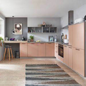
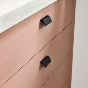
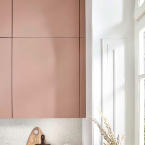
Cabinetry – Dusky Rose works particularly well on painted cabinetry, where its depth can really be appreciated. On classic shaker doors it feels elegant and settled; on flat slab doors it becomes quietly contemporary.
Islands – Pairing Dusky Rose cabinetry with a darker island – charcoal, deep green or even inky blue – creates visual structure while keeping the overall feel soft.
Walls and Ceilings – For a truly enveloping effect, consider carrying Dusky Rose onto the walls or even the ceiling. Much like standing beneath a dusk sky, this approach creates a cocooning, atmospheric space that feels intentional and serene.
Materials That Complement the Tone
Dusky Rose thrives when layered with texture. Kitchens designed with this colour feel best when materials are allowed to speak.
- Timber shelving or breakfast bars add warmth and honesty
- Oak or walnut flooring grounds the palette
- Stone splashbacks introduce natural variation
- Plaster-like finishes echo the softness of the colour itself
The result is a kitchen that feels lived-in, not styled.
Traditional or Modern – It Works Both Ways
In more traditional kitchens, Dusky Rose feels elegant and timeless. Shaker cabinetry, a crisp white butler sink, and a brassy bridge tap create a look that’s warm, welcoming, and quietly classic. Stone floors and softly veined splashbacks complete the picture.
In modern settings, the same colour becomes tranquil and architectural. Slab doors, minimal detailing, and handleless designs allow the colour to do the talking. Paired with streamlined appliances and subtle lighting, Dusky Rose becomes calm, confident, and beautifully restrained.
Favourite Dusky Rose Things Right Now
A few pieces we’re loving that sit beautifully within this palette:
- Farrow & Ball “Sulking Room Pink”: Soft, warm and endlessly versatile
- Little Greene “Blush”: A muted, rosy pink that feels timeless
- Brushed brass Perrin & Rowe taps: Perfect against dusky tones
- Moonshine Print’s Dusty Pink Matisse Print: Subtle, tactile accents
In Summary
Dusky Rose is a colour for January – gentle, grounding and quietly optimistic. Inspired by winter sunsets and softened skies, it brings calm into the heart of the home without losing depth or interest.
Whether paired with charcoal, cream, timber or brass, it creates kitchens that feel restorative, elegant and deeply personal. A reminder that even in the quietest months, warmth and beauty still have a place.
And sometimes, the softest colours make the strongest impression.