Back in June, we fell in love with Coastal Blue – that soft, sky-washed tone that felt like sunlight on sea spray. November’s shade, Ink Blue, is its darker, moodier cousin. Imagine the same horizon, but just after dusk. The air’s cooler, the light softer, and everything seems a little more mysterious.
Ink Blue brings drama and sophistication in equal measure. It’s a colour that asks you to slow down, to sink into its depth. Where Coastal Blue was breezy and open, Ink Blue feels like a deep exhale – calm, cocooning, and quietly confident.
What is Ink Blue?
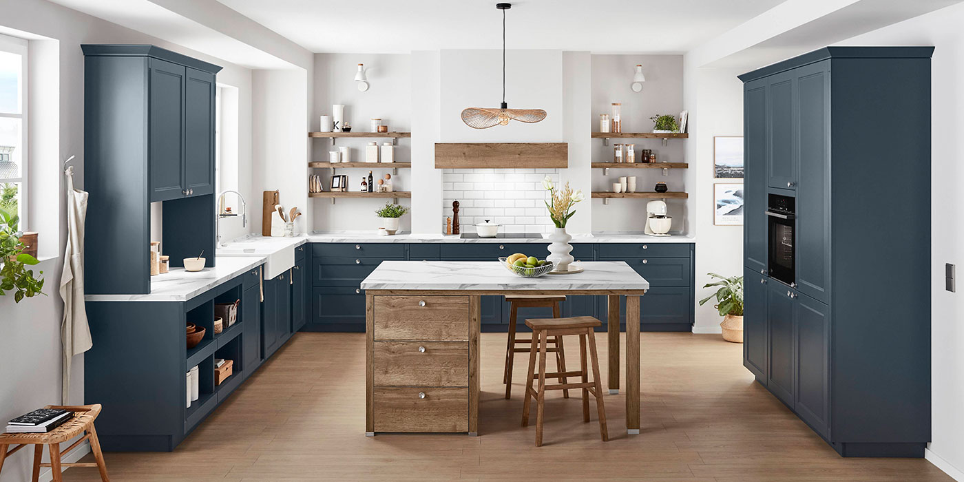
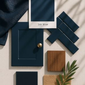
Ink Blue sits between navy and midnight – rich, velvety, and full of pigment, with a hint of grey to keep it modern. It feels timeless yet contemporary, the sort of shade that has graced Georgian panelling and now wraps around minimalist handleless cabinetry with equal ease.
This depth of blue instantly elevates a room. It looks smart and architectural, even when used sparingly. And unlike black or charcoal, it never feels harsh; there’s always warmth hidden in its shadows.
A Little History of Dark Blue
For centuries, deep blue was a colour of power and artistry – think Delft tiles, Regency drawing rooms, and the ink of a handwritten letter. It symbolised wisdom, intellect, and quiet luxury. Even today, it carries that sense of refinement, whether it’s the lining of a tailored jacket or the painted cabinetry of a modern kitchen.
In interiors, Ink Blue connects us to that history while feeling utterly current. It’s the colour of twilight, of night skies, of depth – grounding, but never heavy.
Light and Shadow: Working with the Darkness
There’s a common misconception that dark colours only work in bright, airy rooms. In truth, they can transform low-light spaces into something incredibly atmospheric.
If your kitchen is blessed with large windows, Ink Blue will shift beautifully throughout the day – almost teal in sunlight, deep navy by evening. But if you’re working with a cosier space, don’t shy away. Lean in.
Layer the light instead: wall sconces, pendant lights, perhaps a row of small spotlights tucked under shelves. Even candles. The flicker of warm light against dark blue surfaces feels intimate and cinematic – the kind of setting that makes you want to linger.
How to Use Ink Blue in the Kitchen
This colour is endlessly adaptable, whether your taste leans classic or contemporary.
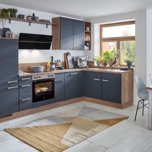
- Cabinetry: Perfect for Shaker doors paired with brass handles for a traditional edge, or slab fronts with a stainless-steel handle trim for a crisp, modern feel.
- Islands: Use Ink Blue to anchor your kitchen – especially striking against paler walls or worktops.
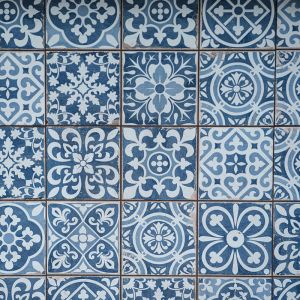
- Walls and Splashbacks: Try dark blue Moroccan-patterned tiles for a touch of artistry and texture.
- Worktops: Crisp white quartz creates contrast; a double-ogee profile adds elegance. For warmth, opt for creamy marble or a soft veined porcelain.
- Floors: Pale oak boards or porcelain tiles keep the look balanced, while exposed brick walls add rustic charm and depth.
Pairings and Accents
Ink Blue is surprisingly flexible. It can look formal or playful, traditional or daring – it all depends on what you pair it with.
- Ink Blue + Brass: Classic and elegant, full of warmth and contrast.
- Ink Blue + Walnut: Rich, inviting, and textural – ideal for autumn.
- Ink Blue + Soft Neutrals: Bring balance with linen, sand, and parchment tones.
- Ink Blue + Ochre or Mustard: Add energy and contemporary flair.
- Ink Blue + Terracotta: A slightly unexpected combination that feels artisanal and grounded.
Style Notes
- Drape a dark blue linen tablecloth over a quartz or timber surface for instant atmosphere.
- Add green foliage – eucalyptus, rosemary, or fern – for a natural lift.
- Bring in metallic touches through handles, lighting, or tapware.
- If you have an exposed brick wall, let Ink Blue cabinetry sit beside it; the warmth of the brick against the cool blue is effortlessly striking.
- Finish the scene with soft pools of warm light – perhaps even the glow of hidden fairy lights reflected on glossy tiles.


My Favourite Ink Blue Things
-
- Farrow & Ball “Railings”: a near-black blue that oozes sophistication.
- Little Greene “Basalt”: bold yet liveable, perfect for cabinetry.
- Hartwell Velvet Accent Chair in “Pacific”: because texture matters as much as tone.
- Candlelight dancing on Equipe Coco “Blue Night” glazed tiles: proof that atmosphere is as much about light as it is colour.
In Summary
Ink Blue is the colour of confidence – deep, composed, quietly bold. It’s the perfect antidote to the grey skies of November, wrapping your kitchen in warmth and sophistication. Whether you pair it with rustic brick, pale quartz, or shimmering brass, it transforms everyday routines into something richer, calmer, and far more considered.
So light a candle, pour a glass, and let the night draw in – your kitchen has never looked better in the dark.