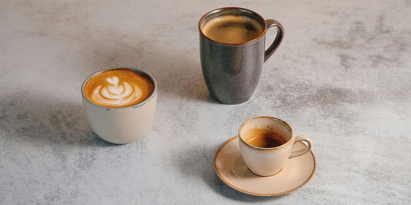
There’s something about April that gently nudges us back into rhythm. The mornings feel a little lighter, the air a little softer, and there’s often that quiet moment before the day begins – coffee in hand, kitchen still, sunlight just starting to filter in.
It’s a small ritual, but one that sets the tone.
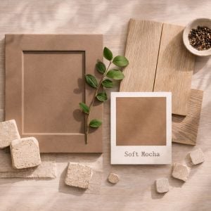
Soft Mocha takes its cue from exactly that feeling. Not the sharp hit of a strong espresso, but the warmth of something slower. A flat white, a latte, a cup you can hold for a while. It’s comforting, familiar and softly grounding – and when brought into the kitchen, it creates a space that feels just as easy to live in.
What is Soft Mocha?
Soft Mocha sits within that beautifully balanced space between warm brown and gentle neutral. It has depth, but it’s softened – a tone that feels rounded rather than heavy, with a subtle creaminess that stops it from becoming too dark.
It’s the kind of colour that shifts slightly depending on what you pair it with. Against pale stone, it feels lighter and more relaxed. Next to deeper woods or darker metals, it becomes richer and more cocooning.
In many ways, it behaves like a grounding layer. It doesn’t demand attention, but it holds everything together.
Why It Works So Well in a Kitchen
Kitchens are spaces of routine, and colour plays a bigger role in that than we often realise. The tones we surround ourselves with can influence how a space feels at different times of day.
Soft Mocha brings a sense of ease. It’s warm without being overpowering, calm without feeling flat. There’s something inherently reassuring about it.
There’s also a subtle psychological link. Warm, coffee-toned colours are often associated with comfort, familiarity and relaxation. They mirror materials we instinctively feel at home with – wood, stone, natural fibres.
In a kitchen, that translates to:
- A softer start to the morning
- A space that feels settled rather than busy
- An environment that encourages people to linger a little longer
It’s not a statement colour. It’s a supportive one.
Inspired by Everyday Rituals
For many of us, the kitchen begins with coffee. Whether it’s a quick espresso before heading out or a slower moment at the breakfast bar, it’s often the first interaction we have with the space each day.
Soft Mocha echoes that ritual beautifully.
A dedicated coffee area, for example, becomes even more inviting when layered with these tones. Think warm cabinetry, a stone worktop beneath your machine, perhaps open shelving with neatly stacked cups. It’s less about creating a feature, and more about elevating something you already do.
It turns routine into something considered.

Colour Pairings That Feel Effortless
Soft Mocha is incredibly versatile, but it comes into its own when paired thoughtfully.
Soft Mocha + Light Oak
A natural, easy combination. The warmth of oak enhances the softness of the mocha tone, creating a palette that feels relaxed and quietly cohesive. Ideal for breakfast bars, shelving or flooring.
Soft Mocha + Creamy Quartz
Light stone worktops lift the depth of the cabinetry, preventing the space from feeling too heavy. Subtle veining adds interest without interrupting the calm.
Soft Mocha + Antique Brass
There’s something particularly beautiful about aged brass against a coffee-toned backdrop. It introduces a gentle glow rather than a sharp shine, adding warmth and a sense of quiet luxury.
Soft Mocha + Charcoal
For a more contemporary edge, deeper tones like charcoal or soft black can anchor the space. Used on an island or in small accents, they add contrast without overwhelming the palette.
Soft Mocha + Soft Green
A muted green – something sage or olive-leaning – introduces a subtle connection to nature. It keeps the scheme feeling fresh and balanced.

Bringing Soft Mocha Into Your Kitchen
There’s no single way to use this colour, which is part of its appeal. It adapts easily to different styles and scales.
- Cabinetry
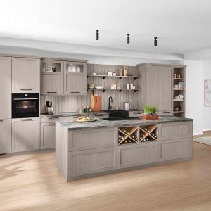
Soft Mocha works beautifully across full runs of cabinetry, especially in spaces that benefit from a little warmth. On shaker doors, it feels timeless and tactile. On slab doors, it becomes more contemporary and refined.
If you’re unsure about committing fully, it also works well as part of a two-tone scheme. Lower cabinets or an island in Soft Mocha can ground a lighter kitchen without making it feel enclosed.
- Walls
For those who prefer neutral cabinetry, introducing Soft Mocha through wall colour can be just as effective. It creates a soft backdrop that complements both traditional and modern designs, especially when paired with lighter units.
- Furniture and Details
Bar stools upholstered in warm tan or mocha tones, timber breakfast bars, or even smaller accessories can all carry the colour through the space. These touches help tie the scheme together without overwhelming it.
Materials That Enhance the Palette
Soft Mocha is at its best when layered with texture.
Timber plays a key role here. Whether it’s a natural oak floor, a walnut shelf, or a wood-effect panel, it reinforces the warmth of the colour and keeps the space feeling grounded.
Stone is equally important. Coffee-toned quartz, softly veined marble-effect surfaces, or even textured tiles can add depth and variation.
Then there are the smaller details – knurled brass handles, ceramic accessories, linen fabrics. These elements catch the light and bring a tactile quality that elevates the overall design.

A Style That Works Across Interiors
One of the strengths of Soft Mocha is its flexibility.
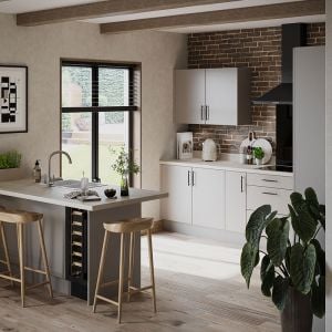
In more traditional kitchens, it feels warm and established. Paired with shaker cabinetry, classic handles and natural materials, it creates a look that’s inviting and timeless.
In modern spaces, it becomes more understated and architectural. Flat slab doors, minimal detailing and clean lines allow the colour to take on a quieter, more refined role.
It’s not tied to one style, which makes it particularly easy to live with.
Favourite Soft Mocha Things Right Now
A few pieces and finishes that sit beautifully within this palette:
- Farrow & Ball “Roasted Macadamia”: A soft neutral, named for its gentle nutty tone
- Little Greene “Mochi”: A colour with muted warmth that fits both traditional or contemporary spaces
- Caesarstone “Georgian Bluffs”: A creamy, stone-inspired surface with subtle movement
- Brushed antique brass bar handles from Hendel & Hendel: Understated and elegant against warm tones
In Summary
Soft Mocha is a colour for April – warm, grounding and gently uplifting. Inspired by morning rituals and the comfort of a well-made coffee, it brings a sense of ease into the kitchen without feeling heavy or overdone.
Whether used across cabinetry, introduced through materials, or layered in through smaller details, it creates spaces that feel relaxed, considered and welcoming.
A reminder that sometimes, the most comforting interiors are the ones that echo the simplest moments of the day.
And often, it starts with a good cup of coffee.